Identity Collage
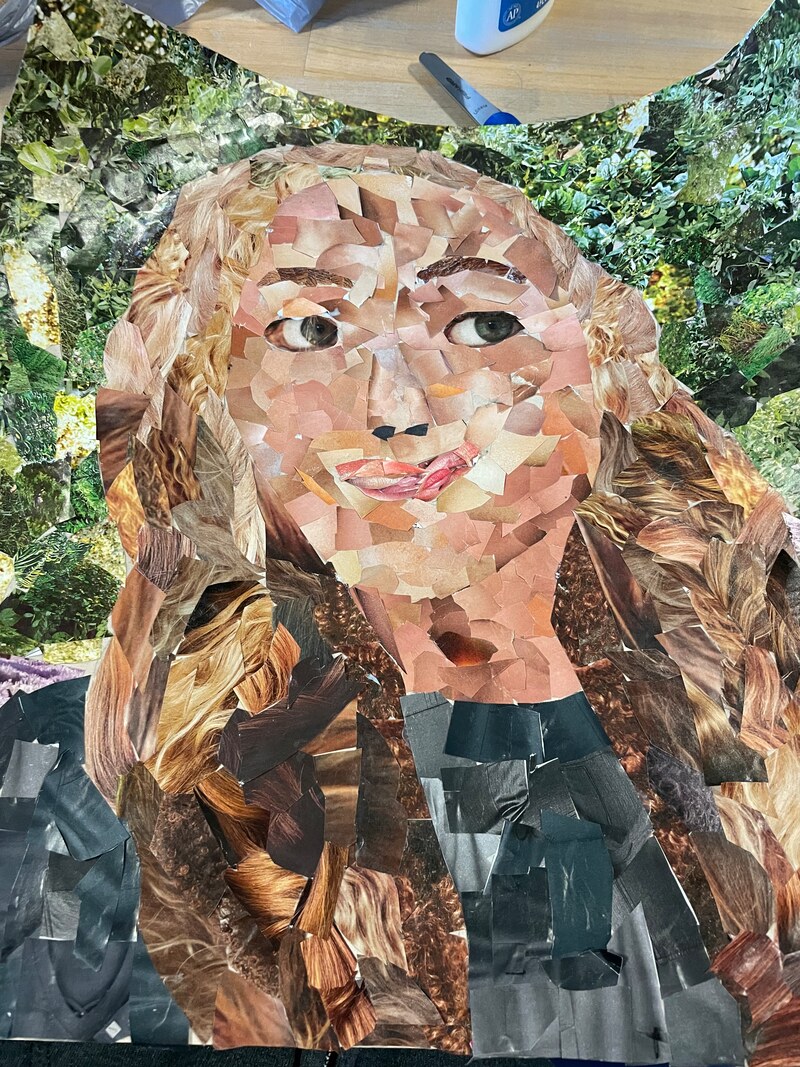
The identity collage project let me express myself. I knew I wanted to incorporate my curly hair along with my liking for outdoors, which explains my green background.
The identity collage project let me express myself. I knew I wanted to incorporate my curly hair along with my liking for outdoors, which explains my green background.
My real anatomy technology project was based on the fact that we would not be where we are today without technology. I wanted to represent how our life relies on technology, so I created a heart with wires connecting apps to the heart. For example we could die in an emergency if we do not have a phone to call 911. I chose to interview my parents, the first question I asked them was how technology was relevant to communicating with friends. Both of their responses were similar, my dad said it helps that he is able to call anytime and my mom agreed with that and also said Facebook. For me, I mainly keep up with my friends on Snapchat. Next I asked what are three technology devices they could not live without, they responded by saying a phone, television, and laptop/I pad. I also agreed with this.
Value of Words is extremely important, words are what make sentences, it is how we communicate. When words are part of an art piece, they often show the significance of the piece. Description often helps the seer to understand the art piece, however I think the description is in the art. I also decided to use my own unique handwriting to really make it my piece. I decided to do something you would see in a coffee shop, so I went with a cup of coffee. I did this as my art piece since coffee shops are one of my favorite places to go and study.
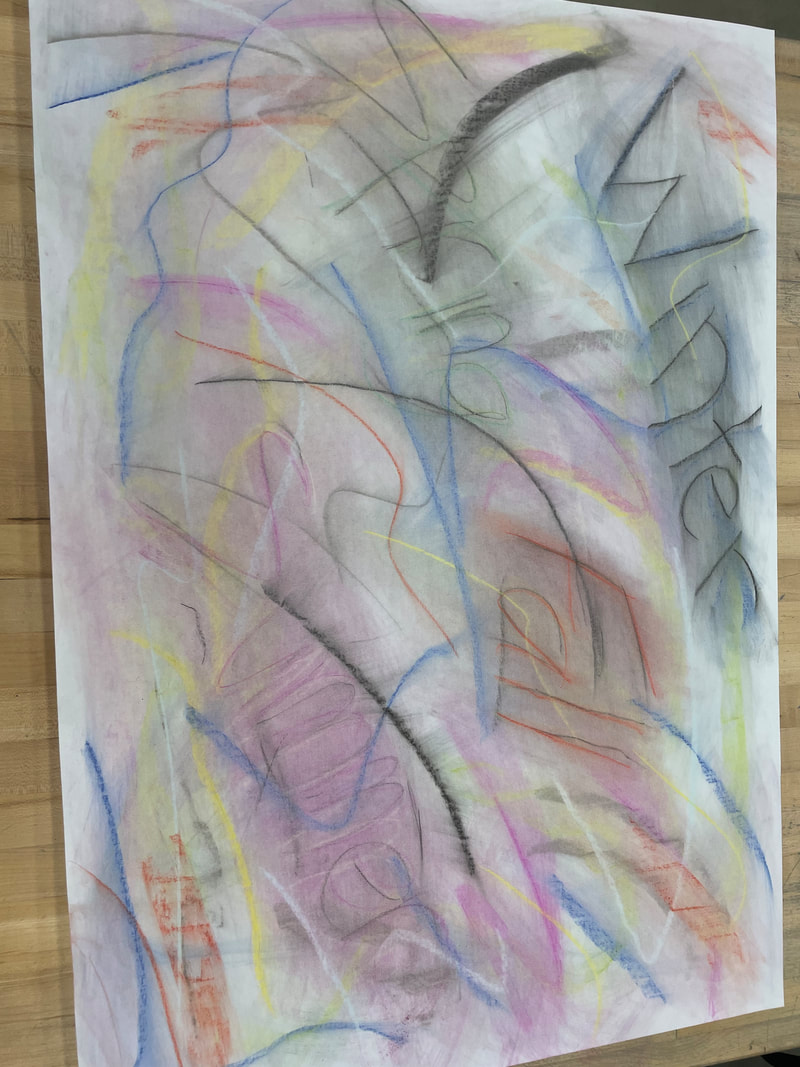
Automatic drawing means to draw without any guidelines, it is you drawing what first comes to mind. Value comes in this drawing through the artist's mind, it shows what they are thinking. An artist may do an automatic drawing to show what they feel. I found this assignment to be intimidating since I like to have guidelines and rules for an assignment. I was imagining the seasons changing, and how much I love summer. I used sharp bright colors around the brighter seasons like spring and summer, when fall and winter tended to have more dark colors due to how cold it can get in Minnesota. I didn't mind doing this assignment or how it turned out, it was very weird to have no rules to this. If I named it I would call it Bright and Gloomy Seasons.
The still life art project was one of my favorites out of the whole semester. It was special to me, I did three mixing bowls to represent how my grandma and I used to bake before she passed. This was also one of the projects that didn't take much thought to finish, since it was one of my favorite memories. I made sure to create a shadow so it would look more dimensional. Water played a key factor in the blending process especially between the brown and blue, it helped the colors come together more. Since I didn't want the bowl to feel blank, I went in and added some blue tones to it, some stronger than others. The most I struggled with on this project was the difference in the blues, I used the same base just added white and gray to parts so they wouldn't blend.
This was my Art for a Cause piece, I did my art for wildfire awareness. Fires happen way to often especially in drier climates like California. Preventing fires is important to me since I love exploring nature. Wildfires not only destroy wildlife but can cause severe damage to many homes. For this project I used black paper and white colored pencils to draw on the trees, I then colored tinfoil and glued it over the paper to create the flames of fire. This was one of the more challenging pieces I've done since we had a shorter time frame to complete this.
Photo used under Creative Commons from Joe K Gage
